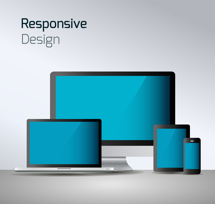
With the ever increasing use of mobile devices such as smartphones, more and more people are accessing websites on these devices. An estimated over 25% of all web traffic is now through a mobile device of some kind – and this number is rapidly growing.
Traditionally websites are designed for browsers on a computer. A computer has relative to a mobile device, a large screen and a very fine pointer – the mouse. In quite the opposite way a mobile device such as a iPhone has a very small screen with a very larger pointer – your finger.
You might have yourself experienced the frustration of accessing a website on your iPhone that’s been designed for a computer. The website looks as it should on a computer, and every works fine, but the magnification of the website is all wrong, and you find yourself constantly doing the “thumb and finger spread” to magnify the website. Then you go to click on a link and you find yourself selecting the link next to the one you were targeting – because of your larger pointer (your finger) actually covers both links. Frustrating!
As a business owner, you can understand how making 25% of your audience have a better experience with your brand and website is a good thing. Mobile Responsive websites are a relatively new thing becoming popular this year. A responsive website changes the design of the website according to what kind of device has accessed the website. If it’s a traditional computer, then the “normal” design of the website will appear. If its been access by an iPhone then a different more user friendly version of the design will appear that caters to the dimensions of the iPhone.
Don’t get what I mean? Take a look at these couple of website examples below. First access them by your computer and then access them by your smartphone.
You see how the design changes and make the information on the website easier to be displayed and accessed on your smartphone?
Unleashing Potential has the technology to do this for a new website or if you are already a client with Unleashing Potential, to convert your current website into being also mobile responsive.
25% is a big audience not to cater for.


